Time picker for Blazor
There are existing components in Blazor that makes it to get different types of user input, like strings, numbers, and date. But what about time?
The problem
There is support for just time in HTML, but it is not supported by all browsers. And it does not automatically map to a .NET type like DateTime or integer.
The solution
My solution was to create this little Blazor component below.
@using Microsoft.AspNetCore.Components;

@if (UseNativeTimePicker)
{
    <input type="time" value="@(new DateTime(2000, 1, 1).AddSeconds(SecondOfDay).ToString("HH:mm"))"
           class="form-control w-auto d-inline" disabled="@IsDisabled"
           @onchange="async (e) =>
                           {
                               var time = Convert.ToDateTime(e.Value);
                               Hour = time.Hour;
                               Minute = time.Minute;

                               await NotifyChanged();
                           }" />
}
else
{
    <select @onchange="async (e) =>
                           {
                               Hour = Convert.ToInt32(e.Value);

                               await NotifyChanged();
                           }" @attributes="InputAttributes" disabled="@IsDisabled">
        @foreach (var hour in Enumerable.Range(0, 24))
        {
            <option value="@hour" selected="@(hour == Hour)">@hour.ToString("00")</option>
        }
    </select>
    <span class="pl-0">:</span>
    <select @onchange="async (e) =>
                           {
                               Minute = Convert.ToInt32(e.Value);

                               await NotifyChanged();
                           }" @attributes="InputAttributes" disabled="@IsDisabled">

        @foreach (var minute in Enumerable.Range(0, 60))
        {
            <option value="@minute" selected="@(minute == Minute)">@(minute.ToString("00"))</option>
        }
    </select>
}

@code {
    [Parameter]
    public int SecondOfDay
    {
        get
        {
            return Hour * 3600 + Minute * 60;
        }

        set
        {
            Hour = value / 3600;
            Minute = (value % 3600) / 60;
        }
    }

    [Parameter]
    public EventCallback<int> SecondOfDayChanged { get; set; }

    [Parameter]
    public bool UseNativeTimePicker { get; set; }

    [Parameter]
    public bool IsDisabled { get; set; }

    public int Hour { get; set; }

    public int Minute { get; set; }

    private Task NotifyChanged()
    {
        return SecondOfDayChanged.InvokeAsync(SecondOfDay);
    }

    public Dictionary<string, object> InputAttributes { get; set; } =
        new Dictionary<string, object>()
        {
            { "class", "form-control w-auto d-inline" }
        };
}
Note that it has support for using native input time component it you prefer to use that (but I do not recommend this). The data type is integer, the number of seconds counted from midnight. Here is some test code you could use to test the component:
@page "/counter"

<h1>Time picker</h1>
<p>Selected time: <strong>@(new DateTime(2000, 1, 1).AddSeconds(SecondOfDay).ToString("HH:mm"))</strong></p>

<EditForm Model="string.Empty">
    <p>
        <Pekspro.Blazor.TimePicker.TimePickerComponent @bind-SecondOfDay="SecondOfDay" UseNativeTimePicker="@UseNative" IsDisabled="IsDisabled" />
    </p>

    <p>
        <InputCheckbox @bind-Value="UseNative" id="usenative" /> <label for="usenative">Use native control (not supported by all browsers)</label>
        <br />

        <InputCheckbox @bind-Value="IsDisabled" id="isdisable" /> <label for="isdisable">Disabled</label>
    </p>
</EditForm>

@code {
    private int SecondOfDay = 3 * 3600 + 14 * 60;

    public bool IsDisabled { get; set; }

    public bool UseNative { get; set; }
}
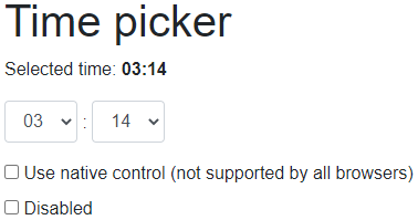
With the default controls it looks like this:

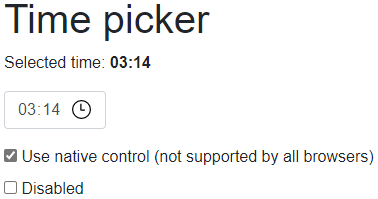
And this is with the native controls:

Summary
This is a basic component. It formats the time as a 24-hour clock and it does not let you select the second on the time. But all these are easy to tweaks if you need to.
In my next post I show you could create a date and time picker component based on this time picker component.