Date time picker for Blazor
In my previous post I showed how you could do a time picker component in Blazor. This time I will extend this so you could select date and time with a single component.
The problem
Just like time, there is no built-in component in Blazor for selecting date and time and the same time. There is however support for selecting date, and I am using that in the solution below.
The solution
My solution is this little Blazor component below.
@if (!UseNative)
{
    <input type="date" class="form-control w-auto d-inline" @bind-value="@Date" disabled="@IsDisabled" />
    <TimePickerComponent @bind-SecondOfDay="SecondOfDay" UseNativeTimePicker="@UseNative" IsDisabled="IsDisabled" />
}
else
{
    <input type="datetime-local" class="form-control w-auto d-inline" value="@(DateAndTime.ToString("yyyy-MM-ddTHH:mm"))" disabled="@IsDisabled"
        @onchange="async (e) =>
        {
            DateAndTime = DateTime.Parse(e.Value.ToString());
            await NotifyChanged();
        }" />
}

@code {

    [Parameter]
    public DateTime DateAndTime { get; set; }

    [Parameter]
    public EventCallback<DateTime> DateAndTimeChanged { get; set; }

    [Parameter]
    public bool IsDisabled { get; set; }

    [Parameter]
    public bool UseNative { get; set; }

    private DateTime Date
    {
        get
        {
            return DateAndTime.Date;
        }
        set
        {
            DateAndTime = value.AddSeconds(SecondOfDay);
            _ = NotifyChanged();
        }
    }

    private int SecondOfDay
    {
        get
        {
            return DateAndTime.Hour * 3600 + DateAndTime.Minute * 60;
        }
        set
        {
            DateAndTime = DateAndTime.Date.AddSeconds(value);
            _ = NotifyChanged();
        }
    }

    private Task NotifyChanged()
    {
        return DateAndTimeChanged.InvokeAsync(DateAndTime);
    }
}
Note that this component is dependent on the TimePickerComponent I showed in
my previous post.
Here is some test code you could use to test the component:
@page "/counter"

<h1>Date time picker</h1>
<p>Selected date and time: <strong>@SelectedDateTime.ToString("yyyy-MM-dd HH:mm")</strong></p>

<EditForm Model="string.Empty">
    <p>
        <Pekspro.Blazor.TimePicker.DateTimePickerComponent @bind-DateAndTime="SelectedDateTime" UseNative="@UseNative" IsDisabled="IsDisabled" />
    </p>
    <p>
        <InputCheckbox @bind-Value="UseNative" id="usenative" /> <label for="usenative">Use native control (not supported by all browsers)</label>
        <br />

        <InputCheckbox @bind-Value="IsDisabled" id="isdisable" /> <label for="isdisable">Disabled</label>
    </p>
</EditForm>

@code {
    private DateTime SelectedDateTime = new DateTime(2038, 1, 20, 10, 20, 30);

    public bool IsDisabled { get; set; }

    public bool UseNative { get; set; }
}
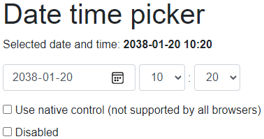
With the default controls it looks like this:

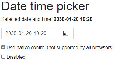
And this is with the native controls:

Summary
Yet again this is a basic component. But I do think it is useful. I have even published a demo project in a GitHub repository.